Introduction
Visual representations of narrative data in qualitative research help stakeholders make sense of complex qualitative data. As researchers, it is advantageous for your team to employ a variety of innovative approaches to visualizing narrative data to help stakeholders visualize and interpret data in a way that aids them in deeper understanding. At its essence, qualitative data is rooted in stories, experiences, and perspectives and utilizing innovative visualization approaches is a great way to bring those stories to life in your research.
The Purpose of Data Visualizations in Qualitative Research
Data visualizations in qualitative research amplify understanding by providing a visual way of showing themes, connections, and patterns within research findings. Examples of settings in which they are applied include case studies, interviews, and focus groups. Developing visual tools to illuminate complexities in qualitative research findings enhances communication to diverse stakeholder audiences.
Data Visualization Innovative Practices
Here are some ways in which your team can start implementing innovative approaches to visualizing narrative data into your qualitative research:
- Incorporate A Variety of Data Collection Techniques
A great way to provide richer contextual understanding of narrative data from the start, is to incorporate unique data collection techniques such as arts-based data collection[1] into your research design. Some examples of unique approaches include:
Photovoice:[2] Photovoice is based on the idea that participants document their unique experiences and perspectives through photography. These can then be used as visual narratives to explore themes and further develop insights within qualitative research.
Digital Storytelling:[3] Digital storytelling involves having participants use multimedia elements such as images, videos, and music to capture their perspectives and experiences throughout the research.
Visual Diaries:[4] The use of visual diaries consist of participants keeping a diary throughout the research study where they can document their thoughts, emotions, and experiences through creative elements such as words, illustrations, or scrapbooking.
- Use Graphics and Images to Represent Concepts
Utilizing symbols, graphics, or illustrations[5] is an easy way to represent abstract concepts, themes, or patterns within narrative data. These typically can easily be embedded in reports, briefs, and presentations which make them great a tool.
- Create Word Clouds
Word clouds[6] are a fun way to visualize the categorization of themes and frequency of words or phrases. Prominent ideas are typically indicated through larger fonts within the word cloud. They are also simple to create!
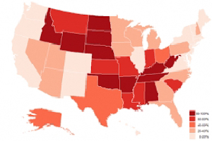
- Develop Thematic Maps
Thematic mapping[7] is a great way to visually organize patterns, relationships, and distributions within narrative data. The use of varying colors, shapes, and elements in thematic maps to visually represent different themes and their connection to one another are reasons why this is a great approach.
- Create a Timeline
A timeline[8] is another way in which to provide a visualization of chronological charts that illustrate the sequence of events, changes, or developments within a participant experience.
- Showcase Stories Through Storyboarding
Like creating a timeline, storyboarding[9] visually represents key events, themes or narratives in a sequential format. Arrange segments of texts or events in a sequential format to show progression or transitions in participant experiences.
- Utilize Interactive Data Dashboards
Incorporating interactive elements in your deliverables such as dynamic visualizations[10] that allow stakeholders to customize data selections, include digital storytelling elements, or incorporate various multimedia formats are all ways to enhance engagement and understanding of qualitative narrative data.
- Collaborate with Stakeholders Whenever Possible
In all qualitative research it is important to collaborate with stakeholders to ensure accuracy, relevance, and clarity. This also helps ensure visualizations accurately reflect the nuance and complexities of participants experiences while respecting cultural sensitives and demonstrating commitment to equity.[11]
Conclusion
Integrating innovative approaches to visualizing narrative data in qualitative research provides a way to effectively represent abstract concepts, themes, and patterns that facilitate clearer communication in reports and presentations. Using simple graphics to represent key ideas, words clouds that depict frequency and categorization of themes, or thematic maps that illustrate relationships and distributions are all fantastic and easy ways to do this. Storyboards, timelines, and interactive data dashboards also enhance stakeholder engagement that foster deeper understanding of qualitative narratives. Incorporating arts-based data collection techniques and collaborating with stakeholders throughout the course of the research ensures that visualizations accurately reflect the complexities of participant experiences and maintain relevance of qualitative research findings.
Take Away
It is crucial for researchers to incorporate diverse and creative data visualization methods to enrich the understanding of qualitative narrative data. Qualitative research provides researchers the opportunity to capture nuanced perspectives and experiences that quantitative data alone cannot capture. These innovative approaches to visualizing narrative data promote inclusivity and deeper engagement with both research participants and stakeholders in ways that not all data can.
[1] Kallos, A. Arts-Based Data Collection Techniques. Eval Academy: https://www.evalacademy.com/articles/arts-based-data-collection-techniques
[2] Soler, A. Using Photovoice in Qualitative Research. QualPage: https://qualpage.com/2022/04/28/using-photovoice-in-qualitative-research/
[3] Davey, N. G., & Benjaminsen, G. Telling Tales: Digital Storytelling as a Tool for Qualitative Data Interpretation and Communication. International Journal of Qualitative Methods, 20. https://doi.org/10.1177/16094069211022529
[4] Veal, C. Jeffries, J., Whitaker, M. Diary Methods. Methods Hub Newcastle University: https://research.ncl.ac.uk/methodshub/methods/diarymethods/
[5] Emory, A. How to Visualize Qualitative Data. depict data studio: https://depictdatastudio.com/how-to-visualize-qualitative-data/
[6] Better Evaluation. Word Cloud. Better Evaluation: https://www.betterevaluation.org/methods-approaches/methods/word-cloud
[7] Cloudy. Thematic Map Analysis for Qualitative Data Analysis. About Usability: http://aboutusability.com/thematic-map-analysis-for-qualitative-data-analysis/
[8] Bhosale, U. How to Use Creative Data Visualization Techniques for Easy Comprehension of Qualitative Research. Enago Academy: https://www.enago.com/academy/data-visualization-techniques-qualitative-research/
[9] Makulec, A. Storyboarding for Data Visualization. Slideshare: https://www.slideshare.net/slideshow/storyboarding-for-data-visualization/45528083#1
[10] Agnese. Great Qualitative Data Visualization Examples. Ajelix: https://ajelix.com/data/qualitative-data-visualization/
[11] Data@Urban. Applying Racial Equity Awareness in Data Visualization. Medium: https://urban-institute.medium.com/applying-racial-equity-awareness-in-data-visualization-bd359bf7a7ff