From Interviews to Infographics: Reporting Qual Data for Community Use
Introduction
Qualitative research plays a critical role in community-engaged studies by capturing lived experiences, narratives, and social complexities that quantitative data often cannot. However, a persistent challenge lies in translating these nuanced insights into accessible, actionable formats for non-academic stakeholders—especially community members who are usually the subjects and beneficiaries of the research. Moving from interviews and focus groups to infographics and other visual summaries is not just a matter of presentation; it is an ethical imperative to ensure findings are accessible, inclusive, and usable.[1] This article explores the rationale, strategies, and best practices for reporting qualitative data in ways that serve community use, with particular focus on participatory analysis, data visualization, and ethical considerations.
The Need for Accessible Qualitative Reporting
Interview transcripts contain rich, context-laden meaning. But dense textual reports may alienate non-academic audiences. As qualitative scholars have emphasized, effective outreach demands outputs in plain language, using storytelling and visuals.[2] Community usability requires avoiding jargon, keeping messaging concise, and choosing formats that appeal to varied literacy levels and cultural preferences. Infographics emerge as a valuable medium: blending thematic visual summaries, icons, quotes, timelines, and narrative structure to present findings in a readily digestible form.
Audience Driven Infographic Design
Designing infographics begins with identifying the community audience and intended purpose. Are we informing policymakers, local nonprofits, or broader residents? Tailored design choices follow. For policymakers, a thematic infographic summarizing key themes and implications works best. For residents, a narrative infographic sharing real quotes, stories, and local imagery may resonate more deeply.[3] As noted by outreach experts, creating separate short outputs for different audiences ensures relevance and readability. One size rarely fits all, especially when communities are linguistically and culturally diverse.
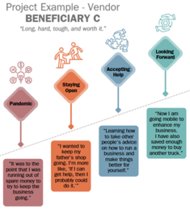
Below is an example of an infographic we at Elite Research created for one of our projects. Through interviews, we captured beneficiaries’ journeys to demonstrate the impact the program we were evaluating had on their lives. We asked questions about their life before, during, and after the program to gain a holistic picture of their story. We needed to determine a way to present the results to the program’s funder that clearly showed how the program was helping beneficiaries become successful. We developed the infographic with this in mind and provided quotes from the interviews to truly highlight the voices of those the program was benefiting.
Visual Techniques for Qualitative Findings
Translating qualitative findings into infographics requires thoughtful adaptation of rich, narrative data into visually accessible formats. Community audiences often benefit from concise, engaging representations that highlight key insights without overwhelming detail. Effective visual reporting maintains fidelity to participant voices while enhancing clarity, reach, and usability.
Choosing the Right Visuals
Avoid overused formats like word clouds unless appropriate. Instead, use icons, simple timelines, diagrams, and comparison visuals. This improves retention and interpretation without distorting meaning.[4] Selecting visuals that align with the nature of the data ensures that themes are represented accurately and responsibly. Thoughtful visual choices can illuminate patterns and relationships while preserving the nuance embedded in qualitative findings.
Visual Hierarchy and Simplicity
Maintain a clean design: consistent colors, readable fonts, adequate white space, and a logical layout. Simplicity and intentionality are key to visual storytelling. Establishing a clear visual hierarchy guides the reader’s eye through the content in a structured and intuitive way. Reducing clutter and emphasizing key messages helps audiences quickly grasp central findings and recommendations.
Incorporating Multimedia
For digital infographics, include audio clips (e.g., participant voices), hover-over tooltips, or clickable narratives. “Hypermodal” formats—combining visuals and sound—enhance accessibility, especially for low-literacy audiences.[5] Multimedia elements can deepen engagement by allowing community members to hear authentic voices alongside summarized themes. Integrating multiple communication modes supports inclusivity and extends the reach of qualitative insights beyond traditional written reports.
Creating Infographics
Designing compelling infographics for community use involves more than aesthetic choices. It requires strategic communication and ethical rigor.[6] Careful planning ensures that visual products are not only attractive but also accurate, respectful, and accessible to diverse audiences. Key best practices include:
- Co-creation: Involve community members in the design of infographics to ensure relevance and cultural sensitivity. Feedback can be gathered through workshops, feedback loops, or pilot testing. Engaging participants in reviewing visuals, wording, and layout strengthens trust and improves clarity. Co-creation also reinforces shared ownership of findings and helps ensure that the final product reflects community priorities and perspectives.
- Use of Plain Language: Avoid jargon and academic terminology. Use language at a 6th to 8th-grade reading level to ensure broad accessibility. Clear, direct phrasing improves comprehension across age groups and educational backgrounds. Testing readability and inviting feedback from non-academic audiences can help ensure that the message is understandable and inclusive.
- Anonymity and Confidentiality: Ensure that quotes or narratives do not disclose personal identifiers, especially in small communities. Even indirect details can make participants recognizable, so careful editing and contextual sensitivity are essential. Balancing authenticity with protection requires thoughtful paraphrasing when necessary. Maintaining confidentiality preserves trust and upholds ethical standards in community-engaged research.
- Cultural Relevance: Incorporate culturally resonant symbols, colors, and metaphors to increase relatability. Visual elements should reflect the community’s identity and values without resorting to stereotypes or oversimplification. Consulting local stakeholders during design decisions enhances authenticity and appropriateness. Culturally grounded visuals strengthen connection and improve engagement with the content.
- Multi-Modal Distribution: Use print, digital, and in-person channels to distribute infographics, recognizing that not all community members have internet access or digital literacy. Diverse dissemination strategies expand reach and promote equitable access to information. Posting materials in community centers, schools, clinics, or local events can complement online sharing. A multi-modal approach ensures that findings are accessible to the widest possible audience.
Structuring the Infographic
Thoughtful structure is essential to ensure that qualitative findings are communicated clearly and persuasively. A well-organized infographic guides viewers logically through context, evidence, and implications without overwhelming them.[7] Strategic organization enhances both comprehension and impact.
Common Organizational Styles
Each style should include a title, context section, thematic insights, visual elements, and a “so what?” summary. These core components provide coherence and ensure that the infographic moves beyond description to actionable meaning.[8] Selecting the appropriate structure depends on the nature of the findings and the intended audience. Infographics often follow one of three structures:
Infographics often follow one of three structures:
- Narrative Style: Tells a story across time or experience arc. This approach is especially effective when illustrating participant journeys, program development, or change over time. It creates emotional engagement while maintaining analytical clarity.
- Thematic Style: Uses sections for each central theme. This structure works well when findings are organized around clearly defined categories or domains. It allows readers to quickly identify key insights and compare patterns across themes.
- Comparative Style: Contrasts groups, places, or time periods. This format is particularly useful when highlighting disparities, shifts, or differences in perspective. Visual contrasts can make patterns immediately visible and support more nuanced interpretation.
Infographic Elements
These visual components enhance clarity, engagement, and interpretive depth when used intentionally and sparingly.[9]
- Icons representing key ideas or stakeholders: Icons can quickly communicate complex concepts and reduce reliance on text-heavy explanations. They also help anchor abstract themes in recognizable imagery.
- Small charts (e.g., bar charts for frequency or ranking): Even in qualitative reporting, simple charts can illustrate patterns such as theme prevalence or participant priorities. These visuals complement narrative data without reducing findings to purely quantitative terms.
- Photos or participant artwork (with consent): Visual contributions from participants can deepen authenticity and foster a sense of shared ownership. Careful attention to consent and representation is essential.
- Pull quotes in large font: Highlighted quotes amplify participant voices and draw attention to particularly powerful insights. They serve as focal points within the layout.
- Visual metaphors (e.g., trees, bridges, houses) to represent processes or relationships: Metaphors can make abstract processes more intuitive and memorable. When culturally appropriate, they provide symbolic depth that reinforces the meaning of qualitative findings.
Challenges
Translating qualitative data into visual formats presents unique challenges. Designers and researchers must balance accessibility, accuracy, and ethical responsibility.[10] Anticipating common pitfalls strengthens both the credibility and usefulness of the final product.
Avoiding Oversimplification
Visual clarity should not come at the cost of misrepresentation. Each theme should be grounded in multiple data points and not exaggerated for visual effect. While infographics require concision, simplification must not distort nuance or erase minority perspectives. Careful review of visual summaries against original transcripts helps maintain analytic integrity.
Protecting Anonymity
Use pseudonyms and avoid identifying information in quotes or visuals unless permission is explicitly granted. Even contextual details in images or captions can unintentionally reveal identities, particularly in small communities. Researchers must carefully vet visual materials to ensure that confidentiality is preserved. Ethical visual reporting requires the same rigor as written dissemination.
Capacity and Tools
If communities lack design skills, partner with graphic designers or use accessible platforms (e.g., Canva, Piktochart). Provide editable templates for sustainability. Building local capacity to update or adapt infographics supports long-term ownership of findings. Investing in user-friendly tools increases the likelihood that visual reporting will continue beyond the initial project.
Action-Oriented Messaging
Effective infographics move beyond presenting findings to encouraging engagement. Clear calls to action ensure that insights translate into reflection, dialogue, or tangible change.[11] Intentional framing can motivate viewers to see themselves as part of the solution.
Turning Findings into Calls to Action
The final section of an infographic should guide viewers to do something: reflect, share, join a meeting, or advocate for change. This might take the form of “Next Steps” icons, bullet lists, or a short recommendations panel. Action prompts should be specific, realistic, and aligned with community capacity. Explicit guidance increases the likelihood that findings will spark momentum rather than remain informational.
Community Advocacy and Policy Impact
Well-designed infographics have been used in environmental justice and public health campaigns to educate and pressure decision-makers (e.g., “Chemicals in the Creek” project on data physicalization).[12] Visual storytelling can translate complex findings into persuasive advocacy tools. Policymakers and community leaders often respond to concise, visually compelling evidence that highlights urgency and human impact. When strategically deployed, infographics can amplify community voice and influence public discourse.
Dissemination and Layered Reporting
Thoughtful dissemination planning ensures that qualitative findings reach diverse audiences. Different stakeholders require varying levels of depth and detail.[13] A layered reporting strategy accommodates multiple needs without sacrificing rigor.
Short-form and Long-form Integration
This structure satisfies both community accessibility and academic or funder transparency. Use a layered approach: Coordinating multiple formats allows for both brevity and depth.
Use a layered approach:
- Infographic = 1-page, highly visual summary
- Slide deck or handout = expanded version for meetings
- Webpage = full detail, with methods and quotes
Integrating these formats ensures that core messages remain consistent while allowing for tailored levels of complexity.
Print vs. Digital
Make infographics available in both print and digital formats. Posters and postcards work well for in-person events; PDFs and web-optimized versions are well-suited for broader dissemination. Considering access, literacy, and technology constraints supports equitable communication. Offering multiple formats maximizes reach and strengthens community engagement.
Ethical Considerations
Ethics in qualitative research extends beyond data collection to how findings are shared. Researchers must balance transparency with participant protection. Even when identities are anonymized, richly detailed narratives can inadvertently reveal participants’ identities, particularly in small communities. Visual reporting formats must therefore anonymize quotes, avoid attributing sensitive data to specific individuals, and gain consent for the use of visual representations.[14]
Furthermore, dissemination should not be extractive. The “ethics of return” emphasizes the importance of returning findings to the communities in ways that are beneficial and empowering.[15] This can include facilitating community-led presentations, creating toolkits, or co-authoring reports with community partners.
Conclusion
Moving from interviews to infographics is both an art and a responsibility. When done thoughtfully, this process amplifies participant voices, democratizes access to knowledge, and builds trust between researchers and communities. It requires careful thematic analysis, participatory methods, clear design, and layered dissemination strategies. Infographics, as tools of visual storytelling, hold immense potential to turn complex qualitative insights into action-oriented community assets. By balancing rigor with readability and ethics with engagement, researchers can make their work not just known but useful—and not just heard but seen.
Take Away
This article outlines how to disseminate qualitative data in an accessible format for community use.
[1] Chambers, R. (2012). Revolutions in development inquiry. Routledge.
[2] Randell, R. L., Wilson, H., Ragavan, M. I., Collins, A. B., Vail, J., Ramirez, S., Amodei, J., Mickievicz, E., Krieger, M. S., Macon, E. C., & Hornik, C. P. (2025). Communicating health research with plain language. Inquiry: A Journal of Medical Care Organization, Provision and Financing, 62. https://doi.org/10.1177/00469580251357755
[3] Arcia, A., Noguchi, E., & Bakken, S. (2023). Toward an Online System to Generate Tailored Infographics: Supporting the Health Information Sharing Needs of Community-Based Organizations. https://doi.org/10.31219/osf.io/8r2cm
[4] Emery, A. (2021). Why I stopped using word clouds. LinkedIn. https://www.linkedin.com/advice/1/what-best-ways-use-infographics-qualitative-research-dissemination-jlt6f
[5] Chandler, R., Anstey, E., & Ross, H. (2015). Listening to voices and visualizing data in qualitative research: Hypermodal dissemination possibilities. Sage Open, 5(2). https://journals.sagepub.com/doi/pdf/10.1177/2158244015592166
[6] Tumiel‐Berhalter, L., & Ortiz, R. A. (2024). Using Plain Language in Research: A qualitative study. Annals of Family Medicine, 22(Supplement 1), 6719. https://doi.org/10.1370/afm.22.s1.6719
[7] Çaka, C., & Dursun, Ö. Ö. (2022). Evaluation of the Effectiveness of Different Infographic Designs. Journal of Educational Technology and Online Learning. https://doi.org/10.31681/jetol.1075352
[8] Majooni, A., Masood, M., & Akhavan, A. (2018). An eye-tracking study on the effect of infographic structures on viewer’s comprehension and cognitive load: Information Visualization, 17(3), 257–266. https://doi.org/10.1177/1473871617701971
[9] He, S., Chen, Y., Xia, Y., Li, Y., Liang, H.-N., & Yu, L. (2024). Visual Harmony: Text-Visual Interplay in Circular Infographics. https://doi.org/10.48550/arxiv.2402.05798
[10] Darcy, R. (2019). Infographics, assessment and digital literacy: innovating learning and teaching through developing ethically responsible digital competencies in public health. 112–120. https://research.monash.edu/en/publications/infographics-assessment-and-digital-literacy-innovating-learning-
[11] Muhtar, St. M., Amir, A. S., & Arya, N. (2024). Utilizing social media for public health advocacy and awareness in digital health communication. Majority Science Journal, 2(1), 270–278. https://doi.org/10.61942/msj.v2i1.96
[12] Perovich, L. J., Wylie, S., & Bongiovanni, R. (2021). Chemicals in the Creek: Designing a situated data physicalization of open government data with the community. IEEE Transactions on Visualization and Computer Graphics, 27(2), 913–923. https://doi.org/10.1109/TVCG.2020.3030472
[13] Chandler, R., Anstey, E. H., & Ross, H. (2015). Listening to Voices and Visualizing Data in Qualitative Research. SAGE Open, 5(2), 2158244015592166. https://doi.org/10.1177/2158244015592166
[14] Tolich, M. (2004). Internal confidentiality: When confidentiality assurances fail relational informants. Qualitative sociology, 27(1), 101-106. https://doi.org/10.1023/B:QUAS.0000015546.20441.4a
[15] Fine, M., Torre, M. E., Boudin, K., Bowen, I., Clark, J., Hylton, D., … & Upegui, D. (2003). Participatory action research: From within and beyond prison bars. https://psycnet.apa.org/doi/10.1037/10595-010

From Interviews to Infographics: Reporting Qual Data for Community Use
Introduction Qualitative research plays a critical role in community-engaged studies by capturing lived experiences, narratives, and social complexities that quantitative data often cannot. However, a persistent challenge lies in translating these nuanced insights into accessible, actionable formats for non-academic stakeholders—especially community members who are usually the subjects and beneficiaries of...
Read More
How to Write Qualitative Research Reports for Funders and Stakeholders
Introduction Qualitative research is a powerful tool for understanding complex social, behavioral, and organizational phenomena. Its strength lies in capturing rich, contextual, and nuanced data that reflect the lived experiences of individuals and communities. To translate insights into tangible impact, findings must be communicated effectively to decision-makers (funders, policymakers, practitioners,...
Read More
Turning Words into Action: How to Spot Actionable Insights in Interviews
Introduction In the business world, qualitative interviews offer a powerful window into users’ needs, frustrations, and motivations—insights which are often invisible in quantitative data. Yet those rich stories can remain dormant if not translated into action. In applied settings like product teams, marketing departments, and customer experience efforts, turning words...
Read More
Publishing Qualitative Research from Community Projects: What Funders and Journals Want
Introduction Qualitative research rooted in community projects often holds the potential to generate deep, contextually rich insights that inform social programs, policy, and participatory action. However, the journey from community engagement to published work requires alignment with the expectations of both funders and peer-reviewed journals. Understanding these expectations is critical...
Read More