Introduction
The effective visualization of complex data is a cornerstone of academic communication. As datasets become increasingly multifaceted and nuanced, the role of academic editors in ensuring clear, accurate, and engaging visual representations of data has grown significantly. Editors facilitate the readability of these visualizations and enhance their ability to convey intricate relationships, trends, and insights to diverse audiences.
In academic editing, visualizations serve as a bridge between abstract concepts and reader comprehension, enabling researchers to present their findings with precision and impact. Poorly designed visuals, on the other hand, risk obscuring critical insights, misrepresenting data, or confusing the audience. The complexity of modern datasets demands a meticulous approach to visualization design, one that integrates clarity, relevance, and accessibility. To address these challenges, academic editors must adopt best practices tailored to the unique demands of scholarly communication.
This document outlines five essential best practices for visualizing complex data in academic editing. These practices include prioritizing clarity and simplicity, matching visualization types to data characteristics, integrating interactivity, applying thoughtful color and design principles, and annotating visualizations effectively.
5 Best Practices
- Prioritize Clarity and Simplicity – In academic editing, clarity is essential when presenting complex data. Overly complicated or cluttered visualizations can obscure the intended message which reduces the effectiveness of scholarly communication. Simplifying visuals involves simplifying the data to its most essential elements, selecting straightforward chart types, and avoiding unnecessary embellishments.
For instance, bar charts, line graphs, and scatter plots are often sufficient for communicating trends and relationships without overwhelming the audience. “Good data visualization communicates complex ideas with clarity and efficiency.”[1] Simplified designs with consistent color schemes and readable fonts ensure that readers can interpret the data without confusion.
- Match Visualization Types to Data Characteristics – Choosing the correct type of visualization for specific data is critical in academic editing. Misaligned visualizations can mislead or confuse readers, undermining the integrity of the research. Editors should carefully consider the dataset’s characteristics and the questions it seeks to answer.
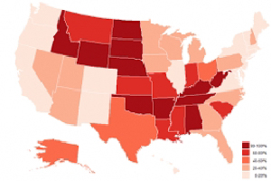
For instance, time-series data is effectively represented with line charts to highlight changes over time, while proportional data is best conveyed through pie charts or stacked bar charts. Similarly, geospatial data benefits from maps that include markers or heatmaps to indicate distributions. Task-driven visualization is vital, where the choice of visual representation aligns with the narrative and research objectives.[2]
- Integrate Interactivity for Multifaceted Data – Modern academic research often involves multidimensional datasets that are challenging to represent in static visualizations. Interactive elements, such as tooltips, filters, and zoom capabilities, enable readers to explore data in greater depth without overloading the visual space. These features can reveal additional layers of information while preserving the clarity of the primary visualization.
Interactive dashboards, created using tools like Tableau or D3.js, allow users to customize their data exploration experience, tailoring the visual representation to their specific interests. Interactivity fosters engagement and facilitates a deeper understanding of complex datasets.[3] Academic editors should ensure that these features are intuitive and aligned with the research’s communicative goals.[4]
- Apply Color and Design Principles Thoughtfully – The thoughtful use of color and design is crucial in academic data visualization. Effective color schemes guide readers’ attention to key points, highlight patterns, and improve the overall aesthetic appeal of visualizations. Poor use of color can lead to misinterpretation or visual fatigue. Academic editors should adhere to best practices such as limiting the color palette to a few complementary hues, using gradients to represent intensity, and selecting colorblind-friendly options to ensure accessibility. Nearly 8% of men and 0.5% of women are colorblind, emphasizing the importance of inclusivity in design.[5]
Additionally, the psychological effects of color should be considered. Warm colors like red may indicate urgency or significance, while cool colors like blue suggest stability and calmness. Academic editors must strike a balance between aesthetic appeal and functional clarity to enhance the impact of visualizations.
- Annotate Visualizations and Provide Context – Annotations and contextual elements are indispensable in academic data visualization, ensuring that readers can interpret the data accurately. Titles, axis labels, legends, and explanatory notes provide essential guidance, clarifying the meaning and implications of the visualized data.
Contextual elements, such as baselines, trend lines, or reference markers, further aid interpretation by situating the data within a broader framework. Effective annotation is central to constructing a compelling narrative, enabling readers to engage more deeply with the research.[6] Academic editors should balance detail with simplicity, avoiding excessive text while ensuring that all necessary information is conveyed. Clear and concise annotations transform complex datasets into accessible and meaningful visual narratives.
Conclusion
The visualization of complex data in academic editing demands a careful blend of analytical rigor and creative design. By prioritizing clarity, matching visualization types to data characteristics, integrating interactivity, applying thoughtful design principles, and annotating visualizations effectively, academic editors can enhance the communication of research findings. These best practices ensure that visual representations are not only accurate and accessible but also engaging and impactful.
Take Away
This article outlines best practices for data visualization in academic editing. As data continues to play a pivotal role in academic research, the importance of effective visualization techniques will continue to grow, reinforcing the editor’s role in bridging the gap between complexity and comprehension.
[1] Tufte, E. R. (2001). The visual display of quantitative information. Graphics Press.
[2] Heer, J., Bostock, M., & Ogievetsky, V. (2010). A tour through the visualization zoo. Communications of the ACM, 53(6), 59-67.
[3] Meeks, E. (2013). Why interactivity in visualization is essential. Visualization Science and Technology.
[4] Cairo, A. (2016). The truthful art: Data, charts, and maps for communication. New Riders.
[5] Ware, C. (2004). Information visualization: Perception for design. Morgan Kaufmann.
[6] Hullman, J., Adar, E., & Shah, P. (2011). Benefitting info vis with visual difficulties. IEEE Transactions on Visualization and Computer Graphics, 17(12), 2213-2222.